Coursework: Film poster research and pre-production
1) List the key conventions of a film poster.
Key images, Cast, Reviews, Mise-En-Scene, Title, Main Character names, Star Reviews, Production company, background image, Release date, tag-line, cast and crew.
2) What makes a film poster instantly recognisable?
The key image/background image, people will recognise the poster visually first before focusing in and seeing the title, therefore the image has to be catchy and very unique, and then the title also needs to be catchy so once someones attention is caught, the title draws them in further.
3) What are regarded as some of the best film posters of all time? Why?
Jaws has one of the most iconic movie posters of all time due to it's creativity, but also the message is sends along as from simply seeing the poster you can begin to make assumptions about what the movie may be about and how the plot unravels. On top of that the poster is rather simplistic whilst still communicating an effective image. This style of poster has now become known to everyone and people are instantly able to identify and spin off or parody version of this poster as over the years it has become a classic.

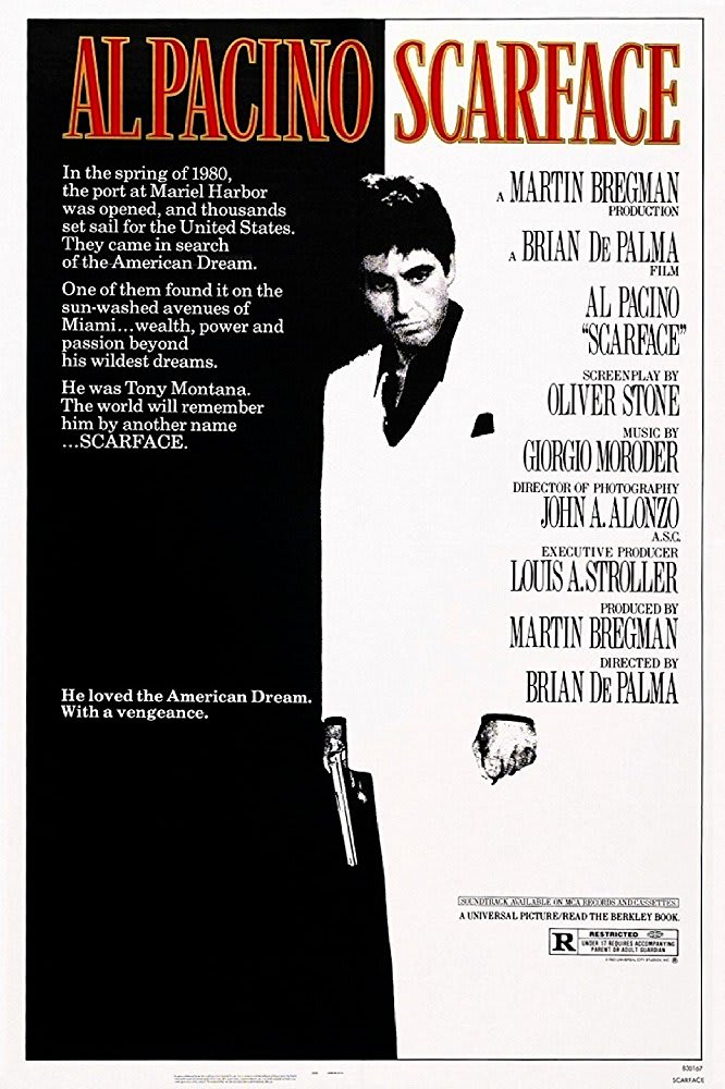
Another example of an iconic movie poster is the Scarface poster. The very limited amount of colour really works well with blending the background image which is simply a two-tone background being black and white, then transforming the main image into that same colour gradient, and once both are combined they work perfectly together. This also leaves tons of room for anything else which the creator of the poster wishes to add, which is used effectively to add a blurb like piece of writing explaining the very basics of what the movie is about. The red title is particularly interesting aswell as it has the title 'Scarface' and the main actors name 'Al Pacino' at the same size, font and colour drawing the same amount of attention to both of them. This usually isn't the case for most movies as the title will be bolder than anything else as it's seen as the most important thing, but here clearly Al Pacino's role is just as important as the movie title.

4) Look back at your statement of intent. What are you planning to produce in terms of your film posters? Can you take inspiration from your research above?
I will take a simplistic approach to creating my poster and make it memorable. I don't want too much going on as it may not draw people in as much, and I want every little thing added to have some sort of conveyed meaning similarly to both of the posters above. I will make sure to have my main characters on screen, but I may choose a different approach and have only 1 character on the front to keep it simplistic. I will also experiment with backgrounds and compare how a real on site background would work, or try create my own background similarly to how it is on the Scarface poster. In terms of writing I've chose to include the bare minimum and only have the most relevant writing on there.
Film poster research - genre
Go back to the five film trailers you researched in your chosen genre (and additional films if you wish). For each film, find at least three different film posters for the film and analyse the following:
1) What conventions are the same on each poster for the same film (i.e. the film's consistent branding)?


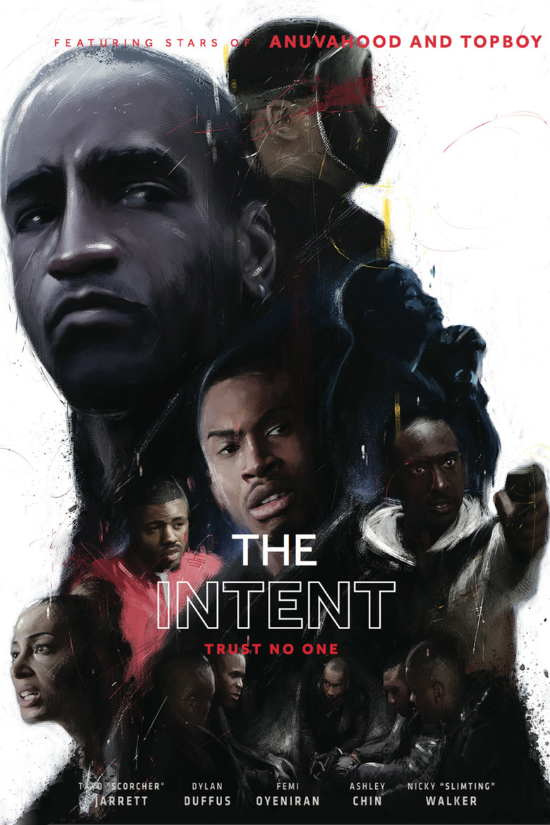
Something that stays consistent is the celebrity endorsement throughout all three posters from Krept&Konan, Chip, and Stormzy. The main characters are also in all three shots in the same formation. Each characters importance is presented by the formation they stand in, showing us a possible hierarchy. They all share the same font for all onscreen text. With each trailer they become more simplistic leaving out more and more text therefore emphasising the characters.

The trailer has a typical hierarchical style showing us all the different characters that will have impact throughout. The style is a realistic drawing, once you have a closer look you will notice how the picture isn't in fact real. This give's it a unique look. One thing it borrows from all posters is the text telling us who created the movie. It also includes the title and tag line both of which are pretty small.

This poster is more of a conventional one showing us less information, but the title is big and bold standing out from the rest of the poster. It also includes the text telling us who created the movie and previous work.

The final poster looks to be more of a drama looking trailer possibly targeting a demographic that enjoys drama more.
2) What differences can your find between the alternative posters for the same film?
3) What target audience do you think each poster is targeting and why? How can you tell?
4) What can you use from these posters in your own film poster planning and production?
Planning and sketching
1) Create a spider diagram or bullet point list of everything you plan to include in your film posters AND all the ways you could target the three target audience segments outlined in the brief: fans of the genre, males, females. Make sure you also create a local film festival in order to meet this aspect of the brief.
2) Produce an A4 sketch for your first film poster, adding significant detail in terms of text and planned images (you don't need to draw the image if you don't want to - but must offer a detailed text-based description if not). Clearly label which segment of the target audience you are aiming for with this poster and where the poster will be displayed (outside location, magazine or newspaper etc.) Remember that each poster can either be landscape or portrait and also needs to link to the local film festival that will be screening the film (see details in brief above). When you have sketched the poster, scan or photograph it and add it to your blogpost.
3) Produce an A4 sketch for your second film poster, clearly identifying the segment of the target audience this poster will be aiming at. Pay particular attention to details you will either keep consistent (to create a brand identity and cover the local film festival aspect) or change (to alter the target audience). When you have sketched the poster, scan or photograph it and add it to your blogpost.
4) Produce an A4 sketch for your third film poster, clearly identifying the segment of the target audience this poster will be aiming at. Pay particular attention to details you will either keep consistent (to create a brand identity and cover the local film festival aspect) or change (to alter the target audience). When you have sketched the poster, scan or photograph it and add it to your blogpost.
Photoshoot planning
1) Which of your characters will appear on each poster? If the characters will be the same on each poster, how will you differentiate the images?
I will use both main characters in each of my posters along with others. For the female poster I will use more female characters than my male one, and in the one targeting teens I will use more of a mixture.
2) What images do you need for each film poster? Write a detailed description.
A compelling and interesting background, possibly an estate, a street alley way (Something on scene). I will have my title across the top of the poster in a bold yet gritty font. I will have the blurb at the bottom. I may switch my background up depending on whether I find enough good backgrounds to use that or on scene, but I will also create my own background using either graphics, or have a solid background.
3) Write a shot list for the photoshoot(s). Make sure you plan a variety of camera shots you will look to capture (medium shots, close-ups etc.) to give yourself flexibility when designing the posters in Photoshop later. Will the photoshoot be out on location or in school with the white backdrop and lighting?
4) What costume, props or make-up will you require for the photoshoot(s)?
I will not need any props for my photoshoot or any make-up. I will have all my characters in similar costumes as shown in the trailer and having them pose in ways that reflect their personalities. For example Igor will be standing tall with head head held high, whereas Wiktor will have a more cautious look.
Key images, Cast, Reviews, Mise-En-Scene, Title, Main Character names, Star Reviews, Production company, background image, Release date, tag-line, cast and crew.
2) What makes a film poster instantly recognisable?
The key image/background image, people will recognise the poster visually first before focusing in and seeing the title, therefore the image has to be catchy and very unique, and then the title also needs to be catchy so once someones attention is caught, the title draws them in further.
3) What are regarded as some of the best film posters of all time? Why?
Jaws has one of the most iconic movie posters of all time due to it's creativity, but also the message is sends along as from simply seeing the poster you can begin to make assumptions about what the movie may be about and how the plot unravels. On top of that the poster is rather simplistic whilst still communicating an effective image. This style of poster has now become known to everyone and people are instantly able to identify and spin off or parody version of this poster as over the years it has become a classic.

Another example of an iconic movie poster is the Scarface poster. The very limited amount of colour really works well with blending the background image which is simply a two-tone background being black and white, then transforming the main image into that same colour gradient, and once both are combined they work perfectly together. This also leaves tons of room for anything else which the creator of the poster wishes to add, which is used effectively to add a blurb like piece of writing explaining the very basics of what the movie is about. The red title is particularly interesting aswell as it has the title 'Scarface' and the main actors name 'Al Pacino' at the same size, font and colour drawing the same amount of attention to both of them. This usually isn't the case for most movies as the title will be bolder than anything else as it's seen as the most important thing, but here clearly Al Pacino's role is just as important as the movie title.

4) Look back at your statement of intent. What are you planning to produce in terms of your film posters? Can you take inspiration from your research above?
I will take a simplistic approach to creating my poster and make it memorable. I don't want too much going on as it may not draw people in as much, and I want every little thing added to have some sort of conveyed meaning similarly to both of the posters above. I will make sure to have my main characters on screen, but I may choose a different approach and have only 1 character on the front to keep it simplistic. I will also experiment with backgrounds and compare how a real on site background would work, or try create my own background similarly to how it is on the Scarface poster. In terms of writing I've chose to include the bare minimum and only have the most relevant writing on there.
Film poster research - genre
Go back to the five film trailers you researched in your chosen genre (and additional films if you wish). For each film, find at least three different film posters for the film and analyse the following:
1) What conventions are the same on each poster for the same film (i.e. the film's consistent branding)?

Something that stays consistent is the celebrity endorsement throughout all three posters from Krept&Konan, Chip, and Stormzy. The main characters are also in all three shots in the same formation. Each characters importance is presented by the formation they stand in, showing us a possible hierarchy. They all share the same font for all onscreen text. With each trailer they become more simplistic leaving out more and more text therefore emphasising the characters.

The trailer has a typical hierarchical style showing us all the different characters that will have impact throughout. The style is a realistic drawing, once you have a closer look you will notice how the picture isn't in fact real. This give's it a unique look. One thing it borrows from all posters is the text telling us who created the movie. It also includes the title and tag line both of which are pretty small.

This poster is more of a conventional one showing us less information, but the title is big and bold standing out from the rest of the poster. It also includes the text telling us who created the movie and previous work.

The final poster looks to be more of a drama looking trailer possibly targeting a demographic that enjoys drama more.
2) What differences can your find between the alternative posters for the same film?
3) What target audience do you think each poster is targeting and why? How can you tell?
4) What can you use from these posters in your own film poster planning and production?
Planning and sketching
1) Create a spider diagram or bullet point list of everything you plan to include in your film posters AND all the ways you could target the three target audience segments outlined in the brief: fans of the genre, males, females. Make sure you also create a local film festival in order to meet this aspect of the brief.
2) Produce an A4 sketch for your first film poster, adding significant detail in terms of text and planned images (you don't need to draw the image if you don't want to - but must offer a detailed text-based description if not). Clearly label which segment of the target audience you are aiming for with this poster and where the poster will be displayed (outside location, magazine or newspaper etc.) Remember that each poster can either be landscape or portrait and also needs to link to the local film festival that will be screening the film (see details in brief above). When you have sketched the poster, scan or photograph it and add it to your blogpost.
3) Produce an A4 sketch for your second film poster, clearly identifying the segment of the target audience this poster will be aiming at. Pay particular attention to details you will either keep consistent (to create a brand identity and cover the local film festival aspect) or change (to alter the target audience). When you have sketched the poster, scan or photograph it and add it to your blogpost.
4) Produce an A4 sketch for your third film poster, clearly identifying the segment of the target audience this poster will be aiming at. Pay particular attention to details you will either keep consistent (to create a brand identity and cover the local film festival aspect) or change (to alter the target audience). When you have sketched the poster, scan or photograph it and add it to your blogpost.
Photoshoot planning
1) Which of your characters will appear on each poster? If the characters will be the same on each poster, how will you differentiate the images?
I will use both main characters in each of my posters along with others. For the female poster I will use more female characters than my male one, and in the one targeting teens I will use more of a mixture.
2) What images do you need for each film poster? Write a detailed description.
A compelling and interesting background, possibly an estate, a street alley way (Something on scene). I will have my title across the top of the poster in a bold yet gritty font. I will have the blurb at the bottom. I may switch my background up depending on whether I find enough good backgrounds to use that or on scene, but I will also create my own background using either graphics, or have a solid background.
3) Write a shot list for the photoshoot(s). Make sure you plan a variety of camera shots you will look to capture (medium shots, close-ups etc.) to give yourself flexibility when designing the posters in Photoshop later. Will the photoshoot be out on location or in school with the white backdrop and lighting?
4) What costume, props or make-up will you require for the photoshoot(s)?
I will not need any props for my photoshoot or any make-up. I will have all my characters in similar costumes as shown in the trailer and having them pose in ways that reflect their personalities. For example Igor will be standing tall with head head held high, whereas Wiktor will have a more cautious look.
Comments
Post a Comment